How to Design an Insta-Worthy Feed
You’ve got your next best idea and you’re ready to share it. That is, until you remember you have to find the perfect Instagram image or graphic to share it. Ugh.
Every brand wants to curate a beautiful Instagram feed, but getting there…that’s a different story. Who really wants to spend ALL THAT TIME creating a gorgeous feed when you could be doing something (literally anything) else?
But your ideas are important and you know that social media can help you grow your business, so you plow forward, spending way too much time creating a carousel or a Reel to post. And then, when all is said and done, your Instagram feed looks like a hodge-podge of design and random thoughts, when you really want it to showcase your best ideas.
Sure, you stand by the ideas, but will anyone find them in your less-than-curated feed? It’s a lot to think about. We want your ideas to actually stand out (and shine) in your feed, which is why we’re going to show you how to design an Instagram-worthy feed.
Staying on brand matters a lot
“Stay on brand.” How many times have you heard that? And how many times have you rolled your eyes (and worried that your eyes will get stuck back there)?
We know you’ve heard it a million times, but staying true to your brand when creating posts for Instagram is the biggest step you can take to make your grid look more polished. But there’s another benefit to focusing on your brand standards: you won’t have to overthink the pattern or cadence of your graphics as much. Branding makes it faster and much easier to create eye-catching graphics on social media.
Think about it like this: if you don’t have a consistent visual brand, not only might people keep scrolling, but you’ll also be putting yourself through some unnecessary stress by trying to create something from scratch every time, with no standards to fall back on.
It is much easier to figure out what to post when you’ve got your brand figured out to the T. If you’re realizing, “Yeah, I don’t have that,” we have a bunch of branding resources to help, including branding basics, when to revamp your brand, and more.
Designing your feed
Let’s just be honest: Scheduling social media around your visuals is tedious and “designing” a grid can take hours. Even if you’ve got tons of free time, this is not how you want to be using it. So… Keep it simple.
Here are a few ways to do just that the next time you sit down to curate your Insta feed:
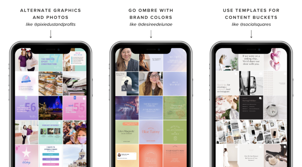
- Alternate graphics with photos. You’ll spend less time designing and will create variety in your feed.
- If you have a lot of brand colors, go ombre. Focus on posting three similar colored graphics at a time, then transitioning to your next color. This prevents you from having to determine which color to design with every time, and eliminates the puzzle of figuring out which color best coordinates with the rest of your grid. You can catch an example of this over on Instagram from @renttherunway.
- If you don’t have very many brand colors, sticking with one pop of color can be really eye-catching (@raeforwellness does a fantastic job of this!) You can also make one color go farther with multiple shades by using varying saturation levels.
Stick to 5-10 templates that you use for your content buckets. @socialsquares — our fav stock photo subscription site — does this with their text-based posts.
How to design your graphics
There’s another element to designing a great IG feed: You want to keep things readable and clear so people know exactly when you’re getting at.
Do you have something you want to say in a graphic? Get rid of those long blocks of texts and split them into carousel posts or add some of it to the caption.
If you want to create a single graphic, how can you cut the copy or design elements down so you get to the point faster? (And can check “design social posts” from your to-do list faster.)
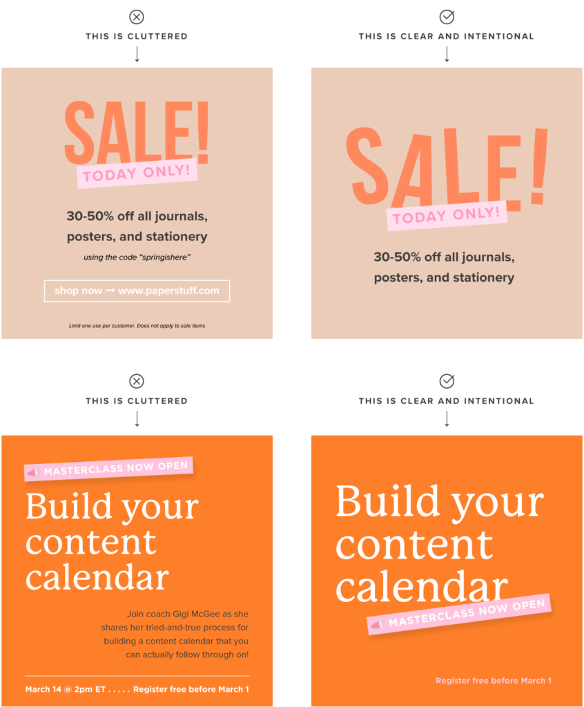
Last, ask yourself: What’s the BIGGEST thing?
You want to pay close attention to the hierarchy of your design. Hierarchy in design means prioritizing the most important information in relation to the size of the design’s elements, whether it’s logos or typography.
By focusing on the biggest thing, you’ll avoid overcrowding your designs and make them more intentional.
Tackling photos
We’ve spent a lot of time talking about graphics, but let’s also just make one thing clear: Your Instagram feed should NOT be all graphics.
Supplement your feed with stock photos and brand photos to create some visual diversity — and to draw the eye. Humans still prefer to see other humans, after all. Plus, between us, when you use more photos, you spend less time designing graphics.
Another bonus to choosing photos for your feed? Photos with real people typically perform better than graphics or “flatlays” or landscapes in terms of engagement, reach, and comments. Of course, graphics still perform really well so it’s up to YOU to decide what you want your IG content to do for your business.
If you’re going to use photos though, here’s our advice.
- Edit your photos! Most of the time, photos will need to be brightened and color-corrected. We like using Lightroom, which has helpful and gorgeous presets ready for download. If the thought of putting on yet another hat and becoming a photographer sends you into panic mode, you can post black and white photos — they’re a breeze to edit! (Note: color images DO perform better on Instagram historically, just sayin’.)
- If you’re using photos and graphics on your feed, you can sometimes get away with photos that don’t perfectly match your aesthetic or brand colors — the general effect still reads as on-brand! Just make sure you’re alternating images and graphics so the overall effect blends well.
- Have a few on-brand or neutral outfits and props handy for your Reels or for taking photos on the fly. This helps keep your brand recognizable while still creating diversity and boosting those “impromptu” vibes.
Our friends over at Social Squares also have great resources and hacks for incorporating images on your feed, including mockups and tech shots, which make it easy to insert your photo or digital content into lifestyle images. It’s an easy way to share anything you want inside a cleaner context!
When it’s okay to go rogue
Creating on-brand graphics helps users recognize trustworthy content faster and helps them spot posts from brands they love. BUUUUT (*takes a deep breath*) there are times when consistency doesn’t matter.
It’s okay to branch out every now and then. We 1000% stand by a feed that isn’t perfectly curated. Social media is meant to be informative and fun. Design should never be the thing that holds you back from sharing your ideas. Play around with a different post style here, a different template there, and add in some new and fun elements that really make it pop!
“But how do I know what makes a design pop?”
Every graphic has its own goal. Not all posts are created equal. Insert other cliches about social media marketing here.
Knowing how to make your designs stand out takes one concept, no matter what you’re creating. Feel free to wipe away that not-so-subtle sweat — you don’t have to go to design school or spend money on online training for this one.
In our FREE 15-minute JUICE IT UP training, our lead designer, Nicole Yang, breaks down everything you need to know for designing your graphic like how to outline the visual hierarchy and reinforce those juicy pieces of info throughout the design.
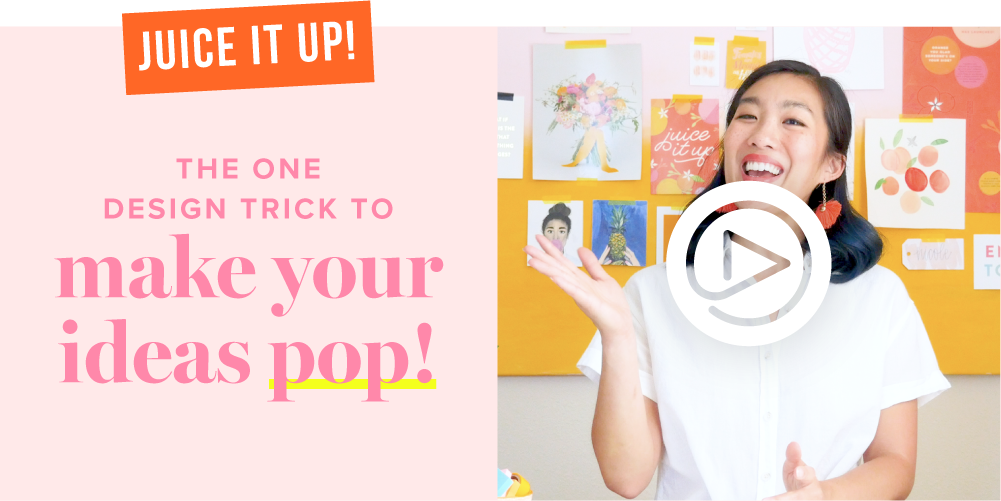
If you want in, click here to watch! It’s only 15 minutes long, but these tips can really help you take your IG designs (and any other designs) to the next level.


