
Back to Brand Basics: The Building Blocks of Your Dream Brand
Nothing is more exciting than finally seeing your branding come together. You’ve got your fonts and color palette picked out, your website and social media are lookin’ amazing, and you’re ready to get started creating dynamic content that will land you your dream clients or boost product sales. Huzzah!
Wait — are you not there yet? Are you feeling like you have the building blocks of your brand (i.e. fonts, colors, logo)… but they’re not coming together like you thought they would? When you feel like something is missing, it’s time to go back to brand basics.
More often than not, it only takes a few simple changes to make your visuals finally stand out and finally bring those ideas to life the way you see them in your head.
First: Know which phase you’re in
When we start a branding project, we break the project up into three “phases”:
- Brand development: This is where we help you define your mission, your audience, and your overall vibe.
- Brand essentials: This is what we’re covering today! Brand essentials include colors, fonts, and (of course) your logo. This is the absolute minimum required to define your brand and keep design consistency and brand recognition across your platforms, like Instagram. It needs to be unique to your business while staying functional, too. It’s often the hardest part to come to terms with, which is why we’re going to chat about it today.
- Brand environment: This is the fun design stuff that comes later. You can start working on this once you have the basics down.
If you don’t know your mission, audience, or how you want your audience to engage with or work with you, it’s not time to start branding. However, if you’ve already got the basics down and you need to learn how to bring it all together, you might want to think about your brand environment — and how to extend your brand essentials throughout! Of course, if you’re thinking that you’re missing the basics and don’t know how to leverage them properly, you’re in the right place. Keep reading!
The essentials that every brand needs for visuals
Every brand needs three things:
- Defined colors
- Defined fonts
- A logo*
We’ll be digging into colors and fonts specifically, because there are so many ways you can use these two elements to really create the building blocks of a strong brand. Just knowing that you use olive green and plum in your branding doesn’t tell you how to use them, nor does knowing what font family you downloaded. So let’s dive in!
* Sort of. What I really mean is something you use consistently, even if that’s just your business name typed out in one of your brand fonts. That still counts. Logos aren’t everything.)
Choosing your brand colors
There are about a million different strategies for choosing brand colors and deciding which ones go together. We won’t get into all that here, but when you choose your brand colors, there are a few things to consider before you start designing anything.
Make your brand colors go further with multiple shades
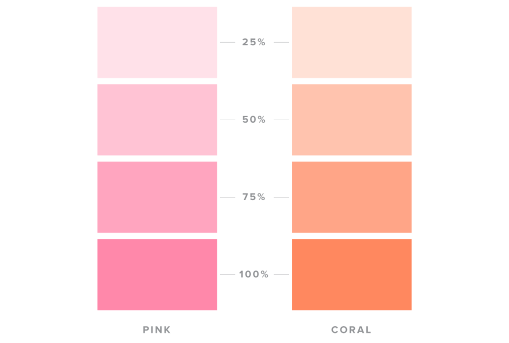
Are your colors pink and coral? Try adding a 75%, 50%, and 25% saturation version of those same colors to make your designs more readable. It forms a cohesive “environment” for your business, allowing you more room to play.
High contrast colors increase readability and accessibility, while pairing colors with similar saturation levels creates tension, making the design difficult to understand.
You’ll also skip the unicorn barf by giving yourself multiple colors that pair well together rather than choosing colors that are unreadable or just straight-up ugly.
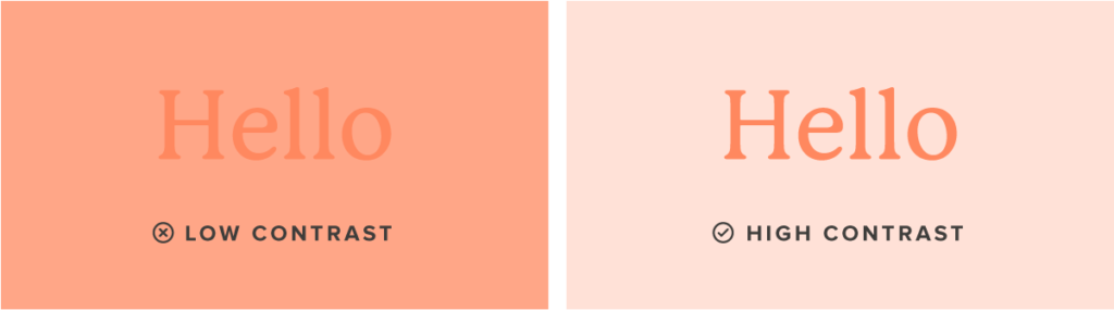

Which one is easier to read?
Notice how you get a headache looking at a few of these. Stick with colors that have an appropriate amount of contrast and you’ll have a winning color combo for life!
Make sure you have some neutrals
You’ll want to have some barely-there colors (aside from plain white) in your arsenal. Even if white is a part of your brand, these shades can prevent fatigue on digital screens by eliminating stark whites and blues, making your content easier to read.

It can also prevent your content from blending in with the platform it’s published on. Have you ever pinned a white Pin on Pinterest? It looks like a mistake.
Keep a dark color in your brand color palette
Readability is everything in design, so make sure to have black as one of your brand colors. Nothing else in your content matters unless people can read what you’re trying to say.
If black feels too harsh for your brand, go for a dark brown or navy. You can even try darker versions of your brand colors.
Choosing your brand fonts
Is your style more traditional, modern, artsy, or professional? Choosing a font that supports your visual identity is one of the most important parts of your brand’s basic elements. With so many styles out there, it can be easy to get swept up in the aesthetics of certain fonts, but the key is to stay visually clean and on-brand.
Keep it simple
A good rule of thumb is to stick to 4 or fewer fonts, but our favorite thing to do is to pick one font with a ton of different styles (bold, italic, light, etc.). You can use it across your brand to give variety and keep things fun while staying cohesive.
Stick to a plain body font
You want to have a body font that exists only to be read. No fancy loops and swirls here, just pure utilitarian and readable lines of text. Remember, if your audience can’t read it, they won’t know where to go to purchase your products or how to work with you.
We recommend using a bold version of your body text for subheading to keep things clean and simple.

Keep headings with fancy scripts short and sweet
Headings should be simple anyway, but it’s crucial to keep it short when using a decorative font. Long headings in a hard-to-read font mean less content for your audience to digest.

Be careful with scripts and hand-written fonts. They should be used minimally and for decorative purposes only. Don’t use them for your most important information – keep the nitty-gritty easy to find.
Need help keeping your brand in check?
BOOM! You’ve got your brand basics down. Hopefully, we’ve helped you see how you can use brand colors and fonts to your advantage, and give you more ways to apply them to your brand’s foundational assets, like your website, social media, client materials, packaging, and more.
Ready to turn those brand basics into a brand environment that really stands out? The Complete DIY Course Design Kit has everything you need to help your graphics look as professional and unique as you are!
Each kit comes with Canva templates to help you make on-brand social graphics, video thumbnails, workbooks, slide presentations, PDFs, and so much more. These kits are endlessly customizable. Each element can be edited, so no more random icons and off-brand stock photos. Just your brand and its bold designs!

Pssst… The Complete DIY Course Design Kits now include font and color packs! So you don’t have to worry about choosing the right color combinations for your brand!

