
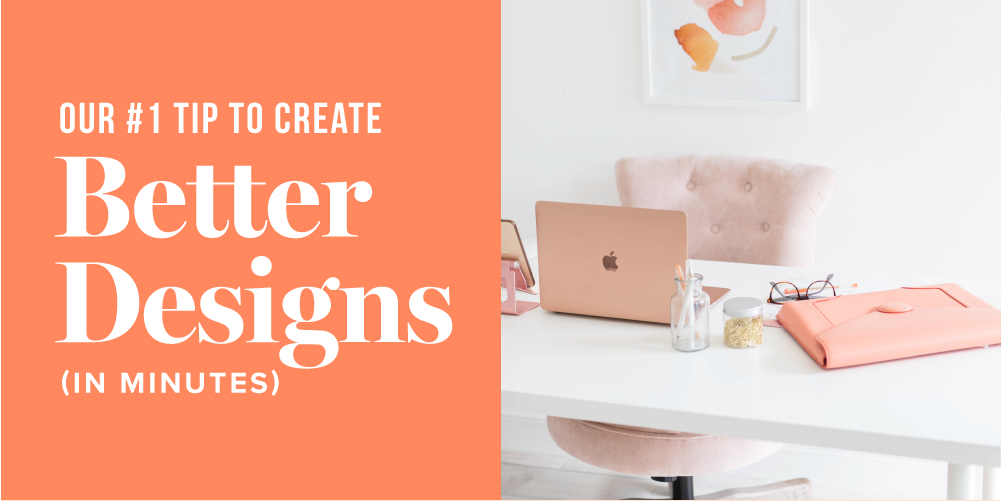
Our #1 Tip to Create Better Designs (in Minutes)
Let’s set the scene: You’re ready to create that juicy new resource for your audience, or that Instagram graphic you know is going to be a total hit. You have the copy, the angle for the design, and you’re ready to rock.
When you start designing, you realize something is just kinda… off. The design is pretty good, but the sections might not pop as much as you want, or the template you’re using may restrict your placement options. Things don’t align quite right, or you might worry that it’s too cluttered visually.
You post the graphic or release the new resource, knowing it’s OK, but not as *chef’s kiss* as you’d like it to be. What went wrong, and how can you improve future designs?
The most common problem we see in DIY designs or templates
First off, let us say: If you’re trying to create your own designs or using templates on platforms like Canva, you’re doing great. We’re not here to tell you that you need to go to design school or learn a complicated tool like InDesign. All you need is to keep a very basic design principle in mind: hierarchy.
What is hierarchy?
In design, hierarchy is a principle applied to visually prioritize the most important information. For example, if you’re having a sale, “SALE” should be the first thing people see when looking at a graphic.

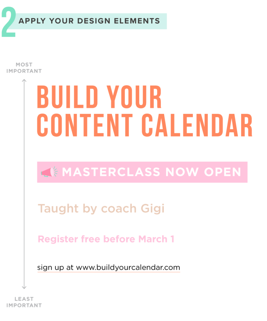
Generally, hierarchy is about the size of elements — whether it’s font, icons, or images within your design. However, hierarchy can also be created by using darker and lighter colors, specific text alignment, and more. Think of your most important information like a bowling ball on a trampoline — it pulls everything else in with it.
So take a look at that graphic or PDF you created that feels just *slightly* off. Is there more focus on copy or elements that shouldn’t be the main focus for your piece? Can you darken or resize the most important information to stand out more?
Hierarchy in action: Make the biggest thing the biggest thing
When we start a design for a client, we always ask: “What is the most important thing for people to take away from the design?” Keeping with the sale example, it’s likely not your brand name, or the website URL where the sale can be found. It’s just that you’re having a SALE!

The key is to make the biggest thing the biggest thing. When you focus on the biggest thing first, you’ll find that your designs naturally become less cluttered and more intentional. You don’t have to pull your hair out over where to put that icon or this piece of copy.

If you’re starting a design or PDF from scratch, it helps to map out the most important information from top to bottom. Then, you can add design elements like fonts, colors, and icons to make sure the eye follows that pattern.
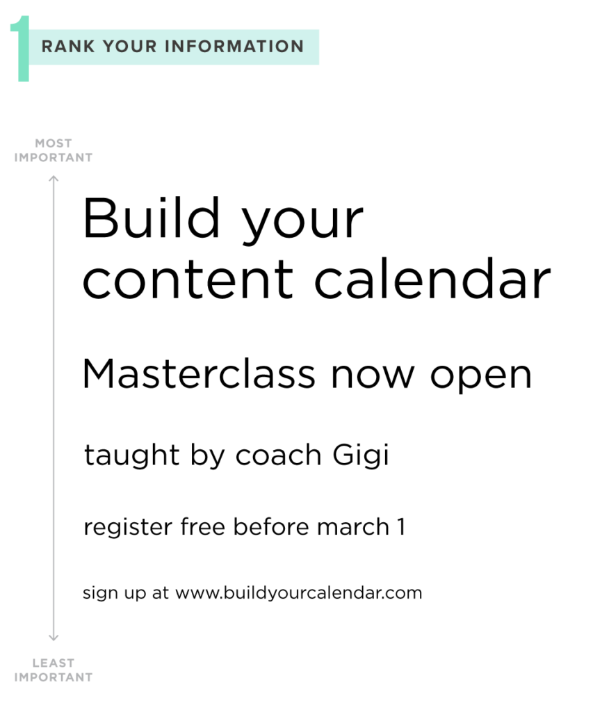
Notice how that list doesn’t have the brand’s logo, a ton of copy, or a huge icon in the list? That’s because those are what we’d call “design dessert” — and not the main course.
See how easy that was?!
Want to learn more about hierarchy — and make your designs pop?
Honestly, when you use this one design tip, you’re bound to create even more streamlined and conversion-happy designs. Why? Because your people are going to be able to see the most important information and take action, instead of trying to infer what you want from them.
Make the biggest thing the biggest thing, and your designs will be easier (and faster) to create, and much more helpful for your audience.
Of course, we know that each resource, graphic, or other design asset you’ll create has its own goals or focus. Knowing how to create visual hierarchy for each of them may not always be straightforward — and you may have more information to include in others.
What takes priority? How do you create visual “weight” in a specific design? There are plenty of questions that come up, and we want you to feel really equipped to make your designs as professional as possible. That’s why we created a FREE 15-minute training.
If you’re ready to take your ideas to the next level and create even more impactful designs, this free 15-minute training is perfect for you. Our lead designer, Nicole Yang, cover tips for “getting out of your head” when you start to design, deciding what you actually need to include in it, how to outline your hierarchy, and then reinforce those important pieces through design.
You’ll learn about design “grids,” weighted colors, and sizing — all so that you can create designs that are supported by hierarchy and some delicious design principles that will have you feeling like a pro in no time!

