Cut Down on Design Time With These 6 Tips
October 19, 2021
If you’re not a trained designer, the reality is that graphic design tasks like creating Instagram carousels or designing a PDF can be tedious. If you run the show yourself (which most freelancers and online business owners do), that’s a lot of time you could be spending on other things. Like dropping your own work to a client or taking a nap.
We’re very pro-nap here, so we are sharing six time-saving design tips right here for you. Let’s dig in.
Define and organize reusable elements
Organizing your design assets might take you the longest to do upfront, but it will save you houuurrssss later on. We do this for every single client that we work with so that our work goes smoother and so that we’re not making design decisions from scratch every time. To organize your design elements, here are a few tips:
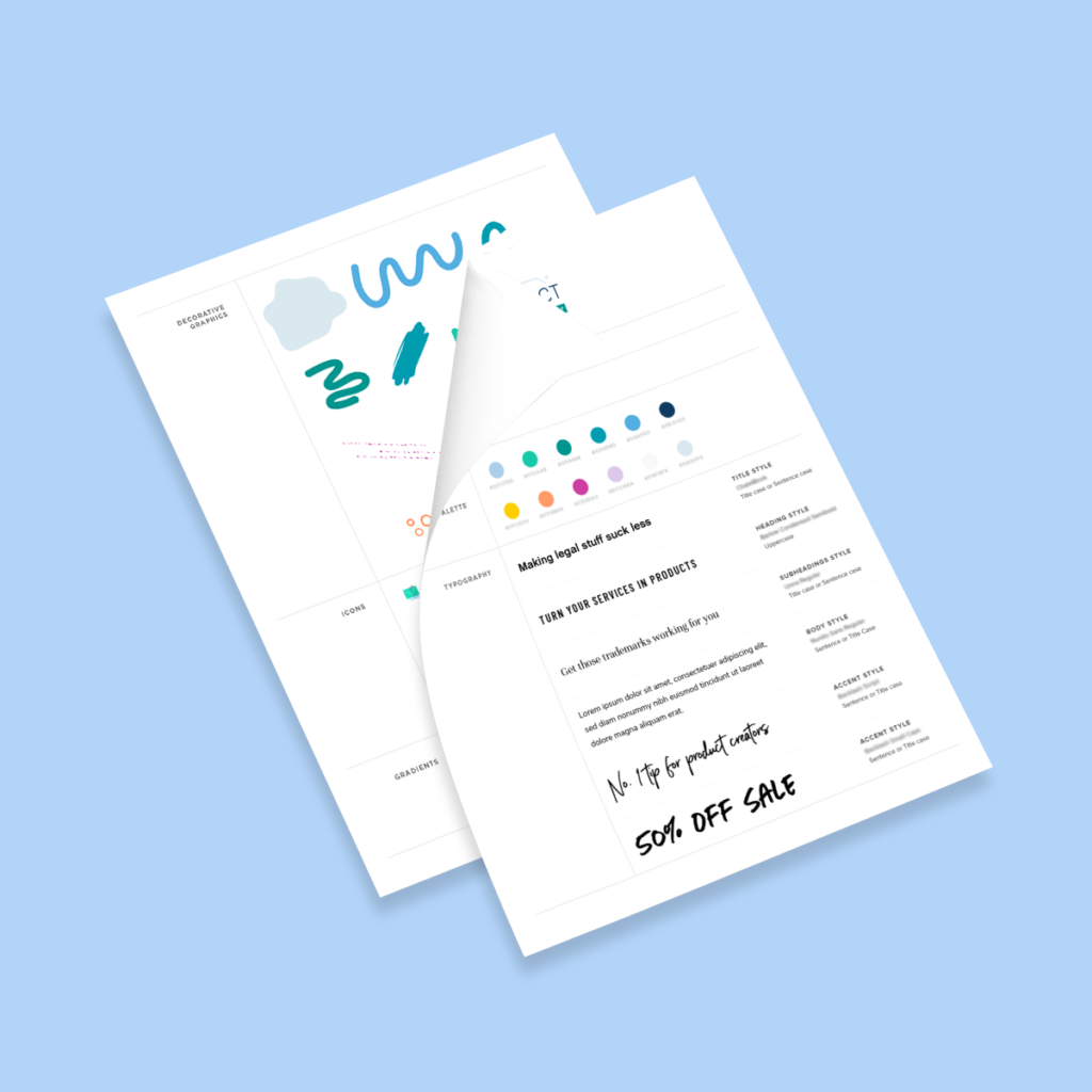
Color: What are your go-to brand colors? If you have any colors you use most often (and colors you only use as accents) separate them into groups and define them. You should also have your hex codes handy in a folder!
Fonts: What are your go-to fonts? Pick 2 to 5. Define which are title fonts, body fonts, and/or accent fonts (usually more decorative fonts like scripts that you’ll want to use sparingly).
Common elements: Make a list of elements you use often, anything from shapes (like arches, stars, squiggly circles, swashes), gradients, icons, patterns. If you have handmade icons, you’ll want to also have those files organized within easy reach.
Photography: If you have brand imagery or are using stock photos, make a folder of your go-to headshots, favorite stock images, etc. If you’re dealing with a lot of imagery, it might be best to create subfolders for headshots, stock images, environmental images, detail images, and group images. Organize by whatever categories best suit your content.
The idea with this step is so you stop wasting time browsing through a million folders for that one headshot or font you need. Everything is just really easily accessible.

Define your formulas
While it’s important to know where individual files and color codes are, you also want to know how to use them together. The more established your design formulas — the mix of colors, fonts, etc. you use — the easier it will be to design things in less time. This is also a great step to take because it will be easier to hand off designs to a junior designer or another team member down the road!
Color: What colors do you like to use together and that you know are readable? Make a few sample rectangles with colored text on top to denote what works best for your brand.
Text: Make a few sample text blocks with a title, subheading, and body style. This is a great place to copy/paste over text that you liked from previous designs. It’ll help you see how you like fonts to be grouped together, the amount of space each line should have between them, and what size they should be in relation to each other to help with hierarchy and readability. Not sure what your font pairings should be? Pulling in some Canva font grouping templates is a great place to start — just edit with your brand fonts.
Put together a brand board
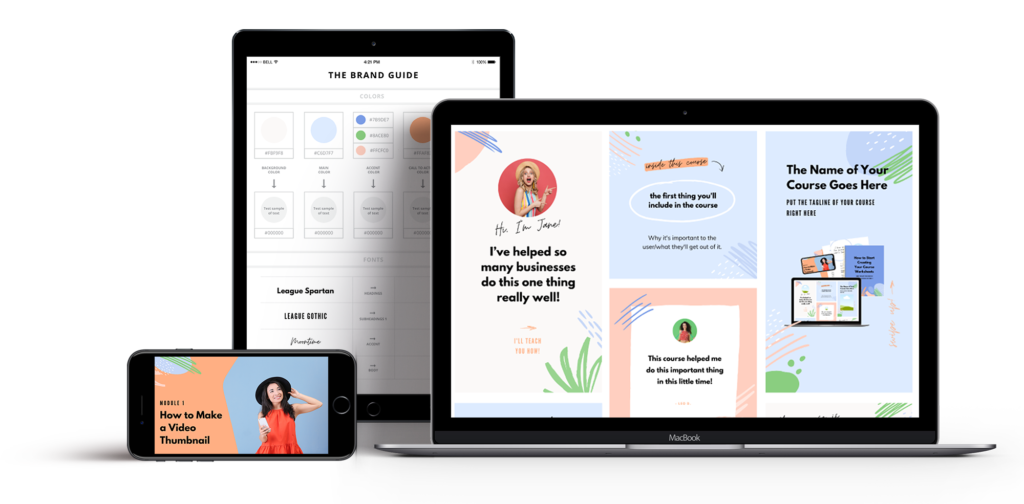
Whether you’re working on Canva or Adobe, put together a single document that compiles everything you just collected above. It’ll be your brand handbook (and lifesaver) every time you start a new design project. Open it along with a fresh document, and start copying and pasting!

On that note, if you’re working in Canva, this is a great time to create your Brand Kit and upload your fonts and colors to Canva. If you’re working in Adobe, you can create a library of your colors, paragraph styles, and more.
Use design templates
Creativity is cool, but getting your message out there regularly (and with a little hair pulling as possible) is better. Use templates for similar types of content, and definitely use what Canva has available to you. If you’re designing a course or want to promote a new offer, you can also check out our Complete DIY Course Design Kits!

Simplify your message
Our last bit of advice? SIMPLIFY.
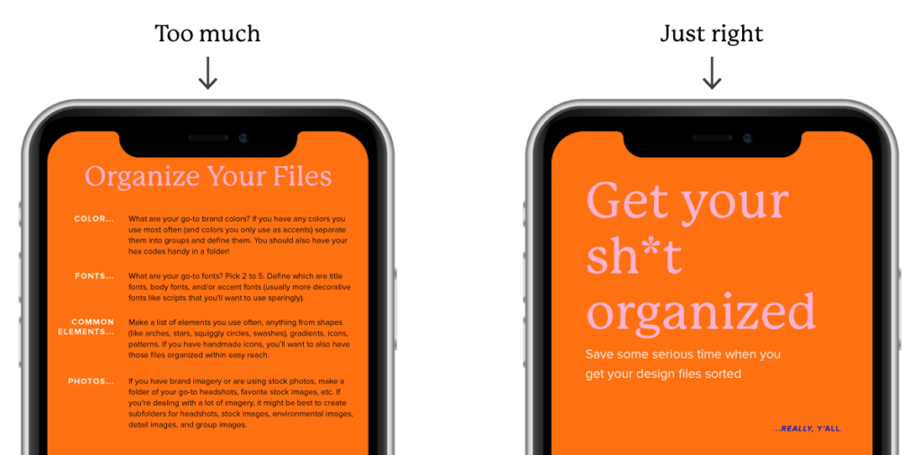
Don’t feel the need to include all the details in a single graphic. Pay attention to how much you’re cramming into one page of your PDF. And always keep in mind where your audience is at in their journey — they don’t need more information than they can handle. They just need enough to get them to dive deeper for more. Stop putting every single thought you have into an Instagram graphic — use your captions!

Make sure the most important part of your message is the biggest and boldest — make the biggest thing the biggest thing. My biggest tip for making design easy is knowing how to rank your information based on priority. It’ll make every design decision afterward a piece of cake.
Need a little more help on this? Want to make sure your designs are on point and not confusing to the eye? Check out this free 15-minute training.
In it, I’ll show you how to make your best ideas pop, and how to create graphics that catch the eye and get people to take action.
Leave a Reply Cancel reply
Copyright 2025 Nicole A. Yang, LLC
Our Grant Program
Where Your Money Goes
YOUTUBE
Privacy Policy
lab@nicoleyangdesign.com
Email us at
Join me on Instagram!
@nicoleayang
Raleigh, NC
Based in