
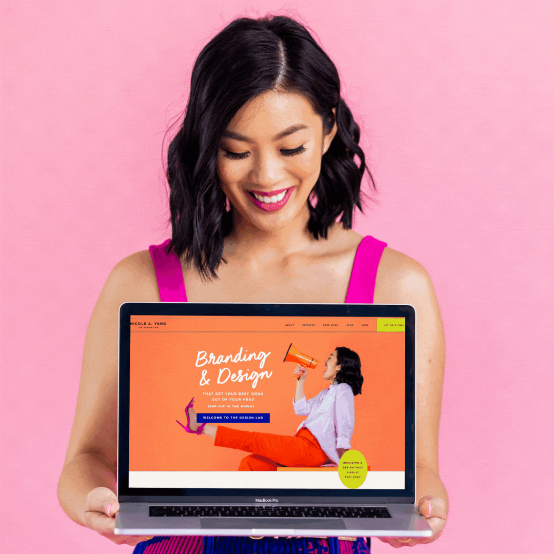
The Design Lab’s New Look
You may have noticed that things look a little different around here.
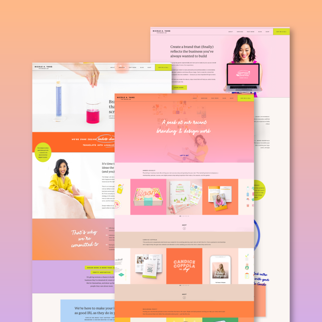
The Design Lab’s website has undergone a little TLC. A brand reboot if you will. And honestly? It needed to happen for a while.
We’re known for being colorful, but over the last couple of years, we’ve gotten even more comfortable being a bit bolder, a bit louder. Now, our colors are more than just bright — they’re used to share our bright ideas and the thoughts we have about business, capitalism, society, and so on.
So we decided to take things up a notch. And we present to you…the amped-up Design Lab!
The catalyst for our new site launch
Kate, our client experience and operations manager, and I (hey — Nicole here!) have been working on new client workflows all year. This coincides with a lot of the general improvements we’ve been making to our client experience.
As a service-based business, client experience is a HUGE part of our branding, and we wanted to make sure we were really elevating that as part of our site’s function and overall look.
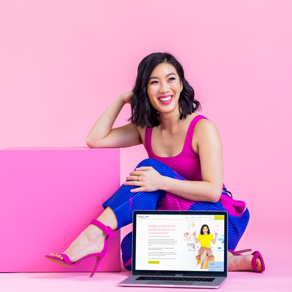
So much of our clients’ experience starts with the information we provide on our website and the way we collect information when they reach out to us. We wanted to find a way to make our website easier to navigate for those who are interested or who’ve decided to work with us.
This means that a good chunk of our website isn’t publicly facing — it’ll only be seen by clients who are onboarding with us and getting more of those crucial deets for their projects.
The focus is shifting
One of the biggest changes for us has been an increased focus on serving women-owned businesses. We’re proud of the clients we serve and the impact they’re having with their businesses, and we want to be louder about our clients, their magic, and the women who run them.
We’ve gotten a lot more vocal about our mission, where our clients’ money goes, and how it’s all tied together.
It’s not that we were shy or too timid to share this before — it’s always been the foundation of The Design Lab. It’s just that we’ve realized that it’s more important to be outspoken about our values as business owners.
We’ve matured
Another reason behind the rebrand of our site? The Design Lab’s design style has also matured. We’re having more fun with our business and embracing color in a way we haven’t before. We’ve always been known for being colorful, but we wanted to go a step further to really reflect the things we’re passionate about.
Our unofficial tagline has always been “bold in vision, brave in business” and this feels way more up our alley. Our goal is that anyone who comes to our website for design services knows we’re not going to hold back — we’re all about embracing and showing off your superpowers.
We’re calling our people in
This rebrand has also helped us reassert our values, which we’ve refined and reviewed over the last few years. And because brand culture is more than a finalized logo and colors you play around with, we could think of no better way to announce our presence than with this colorful, kickass look.
We want our clients to feel like our values align with theirs. That we’ll take their best ideas from their heads and put them on center stage. We want them to feel confident sharing their ideas and give them the push (and assets) they need to move forward boldly.
See what else is new in the Design Lab
If you want to see more on our badass reboot, poke around our website a bit, and feel free to hit us up if you’re ready to kick your brand up a notch (or eleven!).
You can also read more about the mission and values that inspired this rebrand here!

