
Top 8 Website Mistakes to Avoid for Your Brand
With Facebook, Instagram, Youtube, Pinterest, TikTok, and more, thinking about optimizing your website can seem like a task to put on the backburner. But websites are still important, because they’re still the first place someone will look when they want to work with you. A strong website gives you the legitimacy of a fully branded and functioning business. Plus, when you put attention and care into your site, you can make it easier for people to say “I want to work with you!”
However, a few common website mistakes can hurt your reputation — and your business. Let’s dig into the mistakes we see a lot, and show you how to reverse them for your own site.
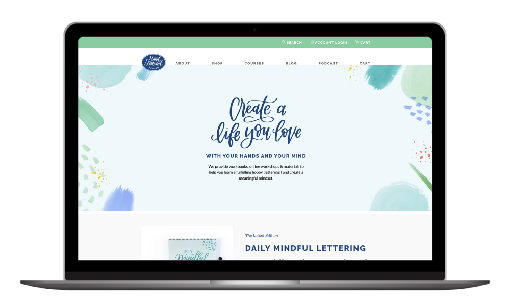
Mistake #1: Waiting too long to say what you do.
For cold audience members who aren’t familiar with you, your website will tell them a lot. It’s important to make navigating your website as easy as possible so these new visitors know exactly what you do and how you can help them.
This isn’t a place to be cutesy or use witty language, either. Use the simplest language you can to explain what you do above the fold on your site. Get fluffy and fun after you’ve been straightforward about what you offer people.
Mistake #2: Neglecting calls to action.
Don’t let a page or a long block of text go by without giving people a chance to click further into your site or to take the next step to work with you/buy with you. Even simple text like “Click on one of the options below” helps people, especially if you have a bunch of clickable links in a row, or if you have buttons or thumbnails that look like plain graphics or photos.
You can also break your site into sections, with each section offering a different call to action.
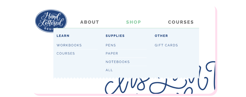
Mistake #3: Getting cute with navigational links.
Your About page should be called your About page. Your contact page should be called your Contact page (or Work With Us page). Your site’s menu and navigation isn’t a place to get cute — people are used to standardizations. What if you were driving down the street and Siri told you to turn 90 degrees toward the ocean instead of just “left”? You’re just confusing people when you mix it up, no matter how clever you think you are.
Mistake 4: Using images where there should be text.
This happens a lot, usually because someone’s website doesn’t have the design capacity they want. You want your header to look a certain way, or to be slightly more eye-catching, but you can’t code it or style it into your site. So you create an image and upload that! All good, right?
Wrong.
When you use images instead of text, and especially when you don’t use alt text in those images, you can mess up the user experience. What if your site images don’t load immediately? People will be faced with something like “Loading error” and an icon of a broken image. Or worse: the spinning wheel of death. Not cute.

Instead, just use text. If you’re really disappointed by the design of your copy, you can always research how to customize it or even save a bit of money to ask a designer.
Mistake #5: Not grouping like with like.
Your website should not be a maze of pages that have no organization to them. People are used to seeing services with other services, being able to search blogs by category, and so on.
For service-based businesses, similar offerings should be grouped together if you have many of them. For instance, a page or section can be created for all your courses, and a separate one can be created for your 1:1 services.
The same goes for product-based sites, grouping products by category or audience. And you should also categorize your blog so people can navigate to the topics that are most relevant to them!
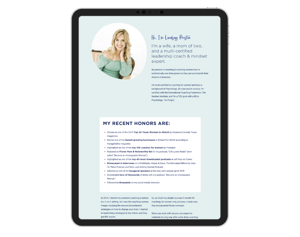
Mistake #6: Not introducing yourself
Tell people your name! And if you’re not the face of the brand, let people know who is behind the brand. Especially if your name is not in your business name or website URL, people want to see people. We’re not into robots just yet.
It’s not enough to just say, “I do this,” or “Get in touch with me.” People want to know what to call you when they get in touch with you or who they’ll be working with when they reach out. Also, it helps people to tell their friends about you!
Mistake #7: Not mentioning how they can work with you.
Uh, hello, how are people supposed to work with you? If you’re thinking, “They just have to click the Contact page,” take a minute to think about it again. Is that really the only way you can tell them how to work with you??
You can let them know on your home page and even on a services “listing” page. Show people all the ways that they can work with you, and even include buttons that say, “Save your spot now!” or “Book your discovery call.” Make it super clear how they can start to work with you.
Have a product-based business? This applies to you, too. People want to know they have a way to get in touch with your shop if something is wrong with their order or if they have questions before placing one. If you’re not working 1:1 with people, you still want to make yourself a bit more accessible. This builds trust!
Mistake #8: Not using your website as an extension of your brand.
Many of us have to DIY a website when we first start out — there’s no shame in that game. But we want to make sure that you’re not just considering how fast you can get a website up. You also need to consider:
- Your branding — are you using the chosen colors, fonts, and designs on your site?
- Your language — does the copy evoke the same emotions you want people to experience when they encounter your brand?
- Consistency — will people who find you on Instagram or YouTube feel like there’s consistency in style or voice?
Your brand environment includes your website but doesn’t end there. Think about how you can carry your voice and design elements through your online presence. That way, once people come to your site, they’ll feel like they already know you and your offers.
Want more design tips for your website and online platforms?
Make sure you’re on our Design Lab newsletter list. Every month, we share tips on branding, design, course creation, and more. You’ll also be the first to hear about upcoming events and new offers!

