The Problem With Color Psychology
April 16, 2021
We all have strong emotions and associations when it comes to color. Maybe you hate the color purple because you ate a funky grape once, or maybe the color yellow makes you feel sunny and smiley.
But just because we have impressions of color for ourselves doesn’t mean everyone has those same impressions. This is where it becomes problematic to use “color psychology” for your branding or brand refresh.
What is color psychology?
Most Design 101 courses will spend a day on color psychology, explaining that blue means trust, red means strength, and yellow means happiness. Google anything about what a color means, and you’ll likely come up with a whole list of associations. But the whole term “color psychology” is a bit of a misnomer. Psychology quite literally means the study of the mind and behavior. And while there may be some research around color theory and how color affects mood, the truth is that it’s still an individual experience.
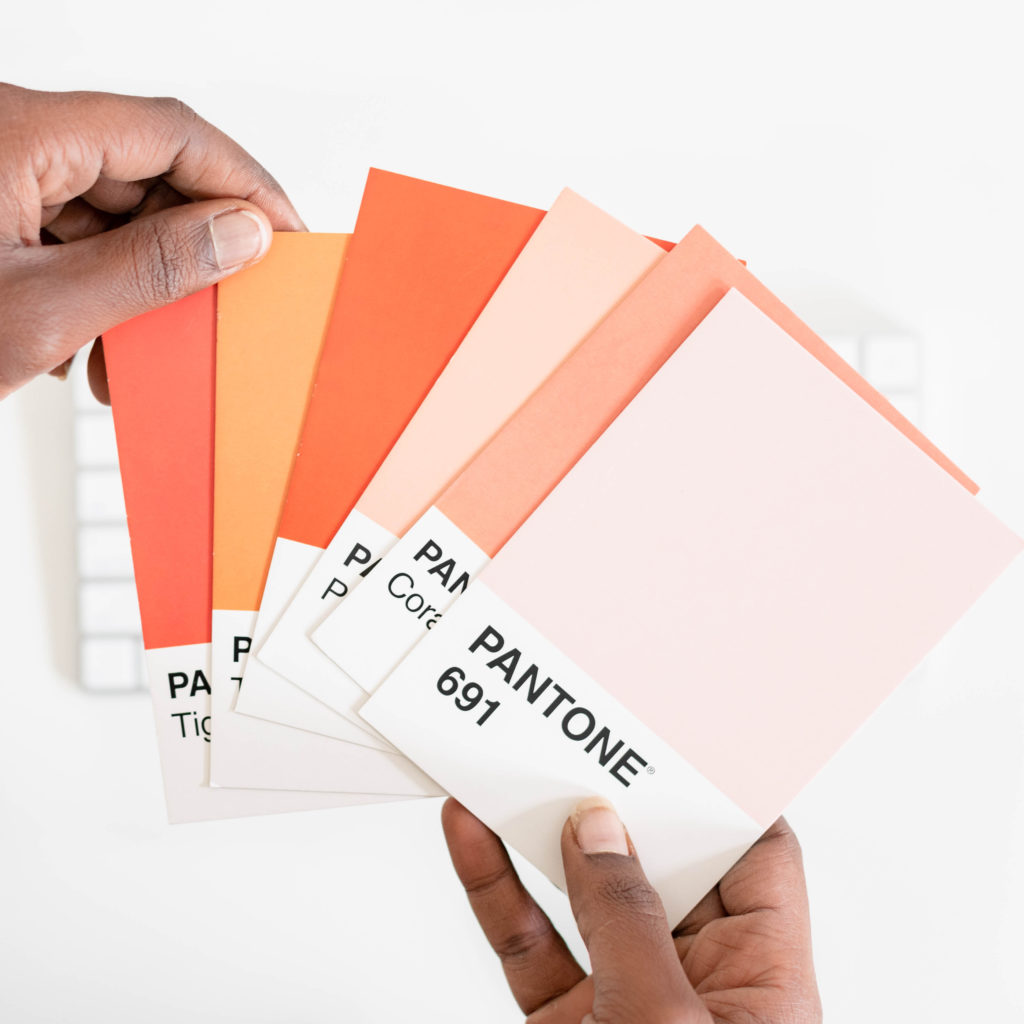
Why color psychology shouldn’t be the end-all-be-all of color selection
Because color psychology is so prevalent, it usually leads to people coming into the branding process saying things like, “I definitely think it should be green for money” or “I don’t want to have too much blue, as that is more associated with calm.” While this isn’t inherently bad, it doesn’t leave a whole lot of room for play and interpretation.
The long and short of it? Colors can’t be put into boxes — just like people. It’s way too reductive when there are 1 billion colors on digital screens alone. Plus, color psychology doesn’t help the branding process, mostly because most color psychology wheels and resources are rooted in an elementary school concept of primary colors, ROY G. BIV style. There are way more colors to the rainbow than just those seven.
Also remember: Just because one person feels calmed by green doesn’t mean another person will. It’s up to you and your designer to find the emotions and experience you want to extend through your branding, and find the colors that best reflect that. That involves testing with your audience, experimenting with different color tones and combinations, and creating a cohesive brand identity. It’s not just selecting one color off a color psychology wheel that’s most closely associated with what you want people to feel; it’s much deeper than that.
So if color psychology isn’t as useful as we thought, what frameworks should we be using when we choose our brand colors? Thinking about color as an environment.
A color is more than one shade
Think about the subtlety of color and the environment you want to create. Think about how your brand and how colors will interact together. For example, you can have all the colors of the rainbow in a brand, if you want to create an environment that feels playful and bright. You may choose to go with more neutral, earthy colors for a brand that is rooted in sustainability.
The idea here, though, is to choose complementary colors that create an environment.
Another thing to think about: Each parent color encompasses hundreds of child-colors. Blue could be sky blue, powder blue, cobalt blue, navy blue, periwinkle, indigo, neon aqua. Yellow could be neon yellow, marigold, ochre, brown, and pale yellow.
Does green feel too calm for your brand? That doesn’t mean that a child-color, like bright kelly green or a neon-like chartreuse, does too. Don’t get hung up on “any shade” of a primary color having the same psychological interpretations.
Then, we have to think about how color meaning and environment changes when we combine multiple colors (and in what proportions).
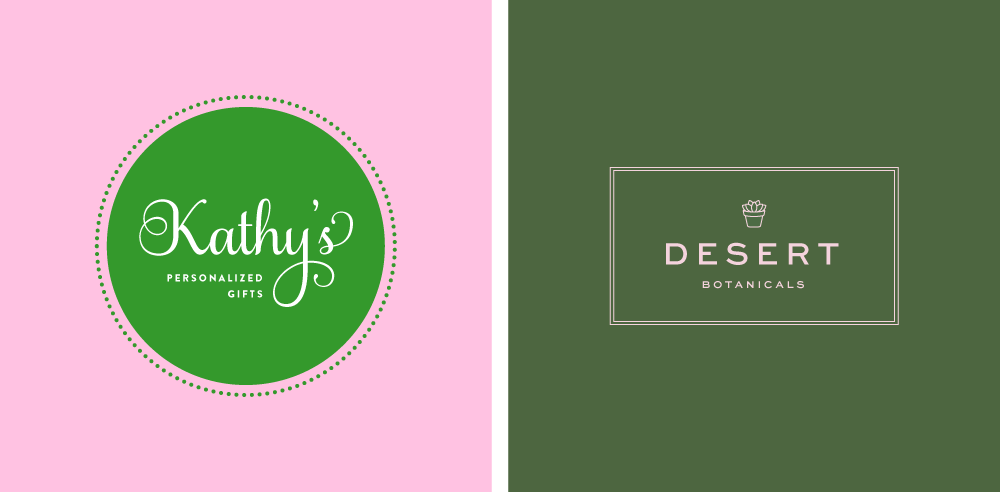
Bubblegum pink + green might feel youthful and gauche. Blush pink + olive green can feel earthy and deep.
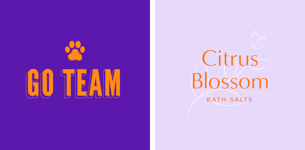
Orange + purple might feel like school colors. Orange + lavender can feel fresh and happy.
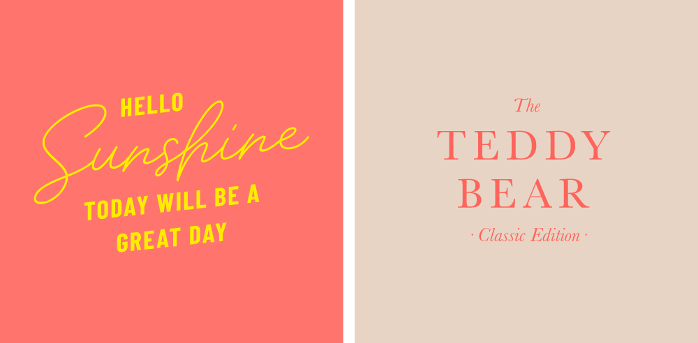
Coral + yellow feels poppy and fun. Coral + taupe can feel luxurious and soft.
Navy + magenta can feel preppy and bold. Navy + Red can feel bold and confident.
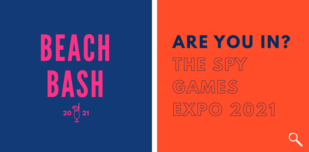
Do you see how sticking to simple primary colors and combinations limits the interpretation of your brand? Can you see how playing with child-colors and combinations can influence a different type of emotion — one that those color psychology wheels don’t include?
Child-colors and combinations also give you an opportunity to expand your brand’s environment. Your more consistent content can be one variation of your colors, while an announcement or launch graphic could be a more bold variation.
Playing with the right colors offers a combination that can create more of an emotional impact than a single color alone.
That concludes today’s lesson on color psychology
We hope you’ve enjoyed this breakdown on the problem with color psychology. While we don’t want to offend any design or marketing professors out there, the truth is: Color is meant to be played with. Not put in a box!
Don’t put boundaries on color. Don’t assume you’re working with just the seven primary colors. Trust your designer to come up with color combinations that represent your BRAND best, and that resonate with your audience. If you’re not sure what colors best represent your brand, or you’re not sure how to create a brand that you can build from, check out the Balanced Brand Lab Kit.
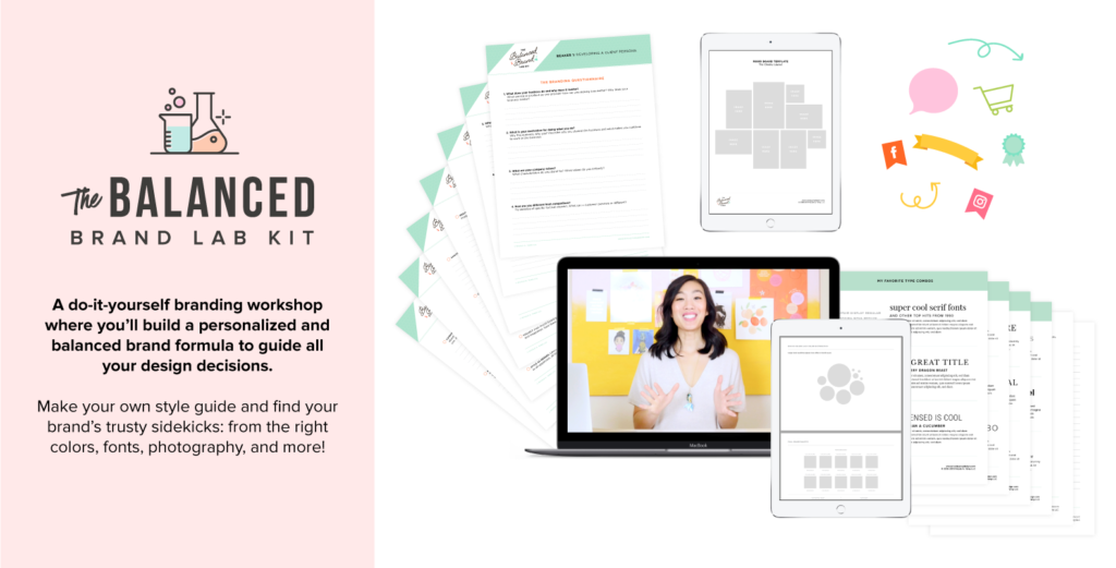
The Lab is a do-it-yourself workshop to build a personalized and balanced brand formula for all your design decisions. Make your own style guide and find your go-to formulas for colors, fonts, photography and more!
What’s inside?
- 8 Video Training Sessions: Nicole will walk you through each component of your brand formula, plus share her screen with you to demonstrate how she experiments and innovates to land on the perfect formula (including colors!)
- Style Guide Template: Download the step-by-step template that will guide you through the unique process of creating your own brand style guide; Nicole will dish out the clear rules and her best advice for using your logo, colors, fonts, photography, and graphics together. (The template is available in Adobe Illustrator or Canva.)
- Downloadable “Lab Notes” Worksheets: Don’t miss a thing when you follow the worksheets and checklists for each section. These resources guide your brainstorming, challenge you to identify the heart and soul of your style, and lead you through how best to utilize your style guide template.
- Branding Questionnaire: Nicole’s tried-and-true questionnaire will help you to discover your brand’s purpose, your client’s aspirations, needs, and desires, as well as the magic keywords and concepts that empower your branding process. (Magic wand and Nimbus 2000 sold separately.)
- Bonuses worth over $250!: Access to an exclusive graphics library, Nicole’s list of favorite font combinations, 4 mood board templates, and the Brand Audit Checklist.
Leave a Reply Cancel reply
Copyright 2025 Nicole A. Yang, LLC
Our Grant Program
Where Your Money Goes
YOUTUBE
Privacy Policy
lab@nicoleyangdesign.com
Email us at
Join me on Instagram!
@nicoleayang
Raleigh, NC
Based in