How to Make a Course Mockup
Creating a mockup of your course might seem daunting, especially when you may have already slogged through customizing your course portal, worksheets, and slides. But, it’s crucial to promote your course and show potential students all of the value packed inside, and it gives you a visual component to all of your social posts, newsletters, and more! (And we all know how much we crave photo breaks throughout big blocks of text.)
Mock-ups might look like design Photoshop magic, but they’re easier than you think! Here’s how to do it.
First things first, make sure you have everything you need
- Go through your list of course inclusions and bonuses. Each one needs a visual to go with it!
- Export images of all those inclusions and bonuses, like course worksheets and slides. Take screenshots of other digital inclusions, like your Facebook group, your video training, your course portal, or your swipe documents.
- Have a few headshots handy, especially if you’re offering something like a Q&A or one-on-one coaching, which might be better depicted by an image of you.
- You might not have a visual of some of your components, and that’s okay! We’ll get to that in a second.
Brainstorm how you’d like to present the information.
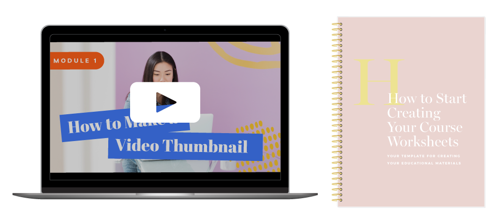
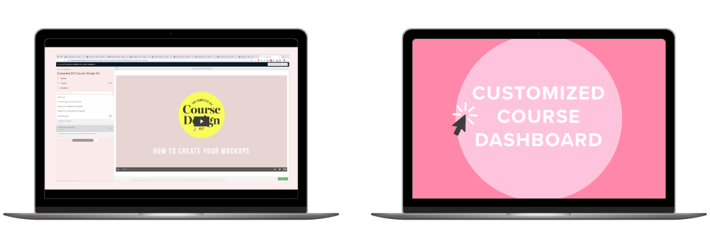
In general, I like to frame digital things (like Zoom calls, Facebook groups, course portals, and slides) inside iPads or laptop mockups. It helps give users a sense of what they’ll see once they’re interacting with the course, and it’s a useful environment for things that don’t have a physical presence. All other physical things (like workbooks or print-outs can be mocked up as they actually exist in real life — as workbooks and print-outs!)
Here are my general guidelines for how to mock up common inclusions:
- Audio interviews on a phone
- Coaching on a phone or ipad, or with a photo of your face
- Slides on a computer or fanned out or both
- Swipe files, checklists, individual worksheets as single pages
- Workbooks, guides, anything with multiple pages can be formed as a workbook or fanned out as pages, or both
- Videos on a phone or computer with a play button
- Community, calls, etc. can be screenshots of your facebook group
How to make a mockup for inclusions that don’t have an image
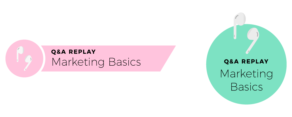
Use icons and basic shapes to your advantage! They’re easy to make and they have the added bonus of giving your mockup some visual variety and simplicity.
For instance, an audio interview or Q&A replay might be better formatted as simple text that says, “Q&A Replays” paired with icons of earbuds or headphones, all packaged together in a circle or a rectangle.
This same approach can be used to draw attention to common call-outs like items that are bonuses or limited-time offers. It can also be used in place of inclusions that might be repetitive. For instance, instead of showing 5 laptops for 5 different bonus training videos, you might choose to mock up one bonus video training with a star or circle that says, “5 video training bonuses!”

Play around with your style.
Not all inclusions need an exact replica of what’s being provided! This might be really difficult for some inclusions that don’t have a physical form, and some course creators prefer to have simpler stand-ins that represent what’s being offered rather than giving prospective students such an in-depth sneak peek of the materials. It’s okay to use text and colors to your advantage.
Layer it all together
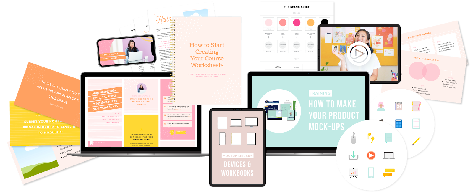
The final step! You’ll want individual mockups of each piece of your course, plus a mockup of everything together so that students can see ALL THE VALUE they’re getting from your course.
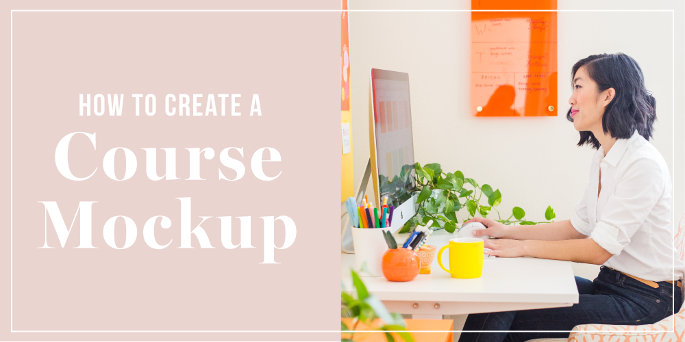
Keep things relatively proportional to real-life (so no giant iPhones as tall as workbooks, please!). Think of formatting these mockups the way you would as if you had all of those components on your desk. You’d likely keep big desktop computers in the back, and smaller devices in the front. Some things can overlap. More two-dimensional items like fanned out course pages are easy to stick behind everything, or fanned out to the side. Here’s an example from our Complete DIY Course Design Kits!
Now for the big question. Where do I get these blank iPad, laptop, and workbook images and how do I edit them???
Mockups for all of these objects can be purchased from designers on Creative Market, but they’ll more than likely require some Photoshop knowledge and may come with some background images or shadows that can be tough to work with.
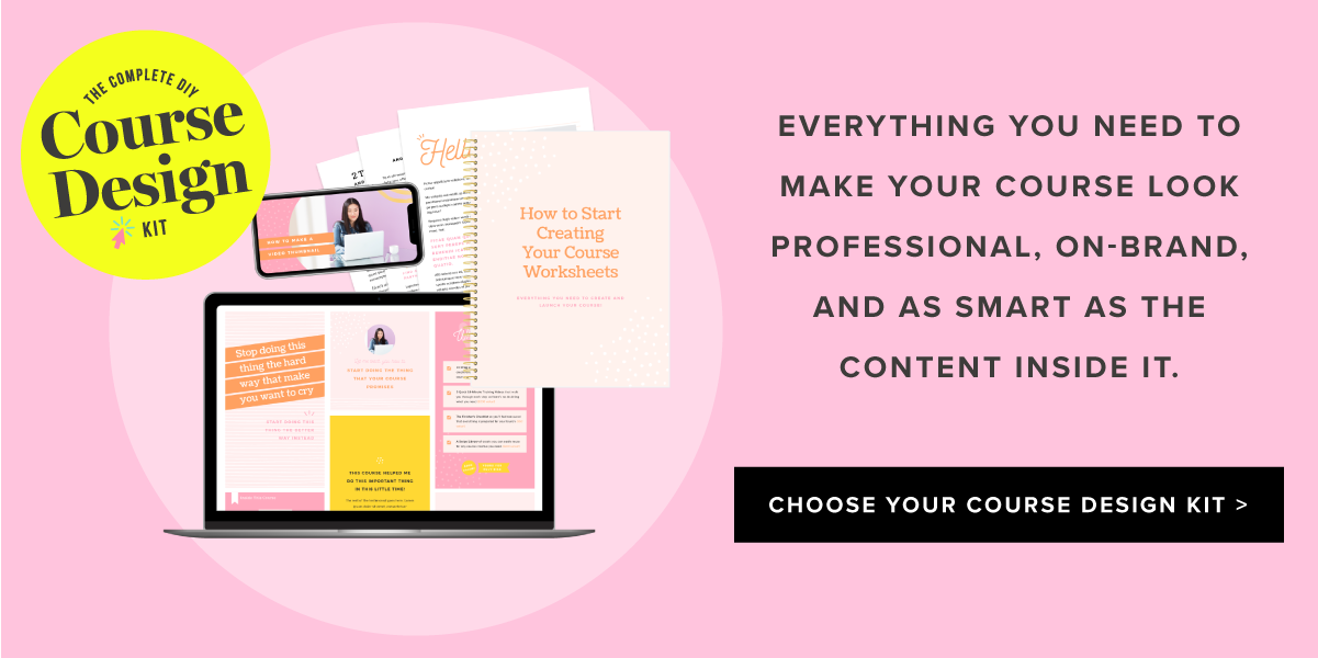
I’ve made a better solution that’s completely editable on Canva, and it comes with a training video from me where I share my screen with you and show you exactly how to put these mockups together. It’s available as a free bonus in the Complete DIY Course Design Kit, where you’ll receive EVERYTHING you need to design and promote your course.