Cocoa Daisy
WHAT WE CREATED
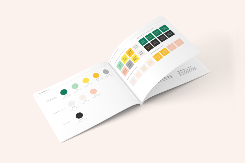
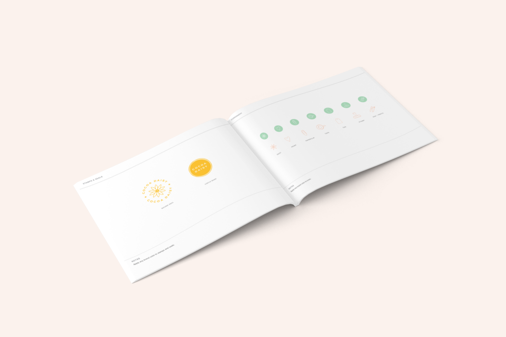
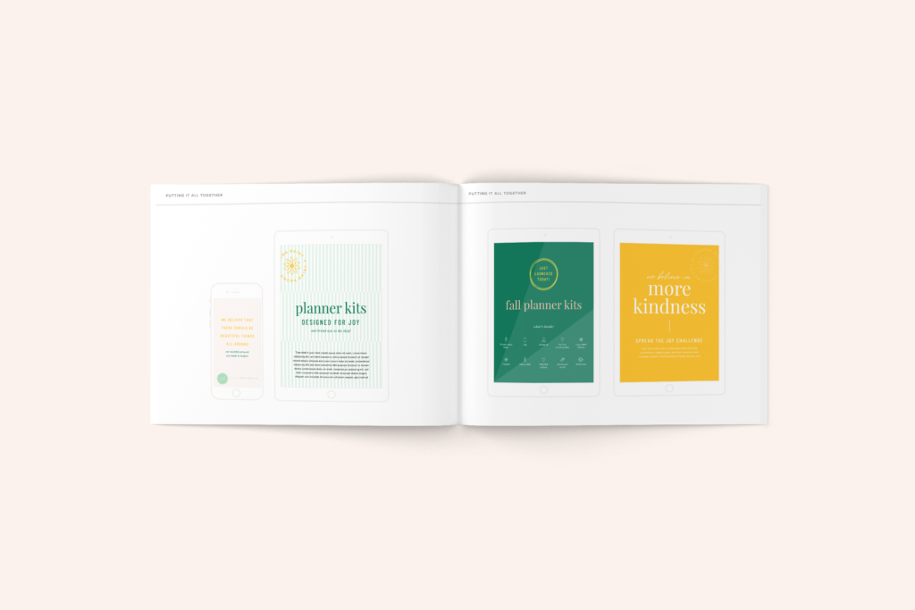
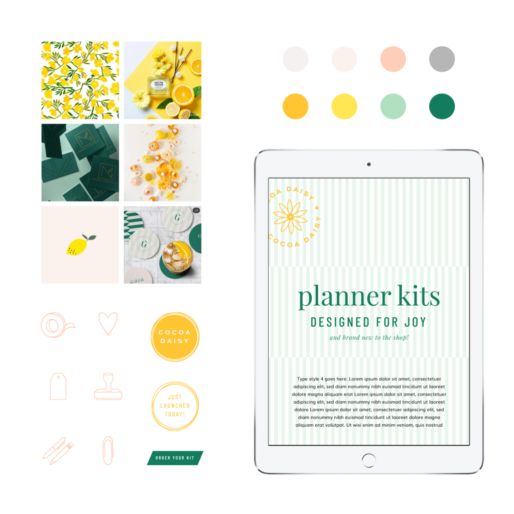
A logo, color palette, type styles, iconography, patterns, and a full style guide outlining color usage and combinations, typography usage and combinations, graphic element usage, and photography styles
CLIENT PERSONA
She’s a working mom with priorities to juggle and people to love on. Even though she feels useful at work and enjoys her home life, she still craves a little bit of “me time” every week, and the feeling that she’s creating something with her hands and her imagination. She loves art, stationery, and lovely trinkets, but she’s picky about what to bring into her home — choosing only items that make her smile and remind her of happy memories.
BRAND KEYWORDS
Brave, knowledgable, smart, fun, punchy
BRAND STYLE
Mature, on-trend, inviting. Feels creative and abundant while communicating a love for style and the pretty things in life. Greens and mints mixed with the traditional “daisy” color palette elevates the brand to something more sophisticated and worldly. A clean look and new neutrals provide design flexibility, while subtle hand-drawn elements nod back to the product artwork without overpowering or clashing with the monthly themes.