
Design Updates Part 1
We’re on a mission to make design easier! Every week, we answer a question from our Design Hotline— an Instagram line where we walk you through your biggest design questions! Here’s a submission we recently answered.
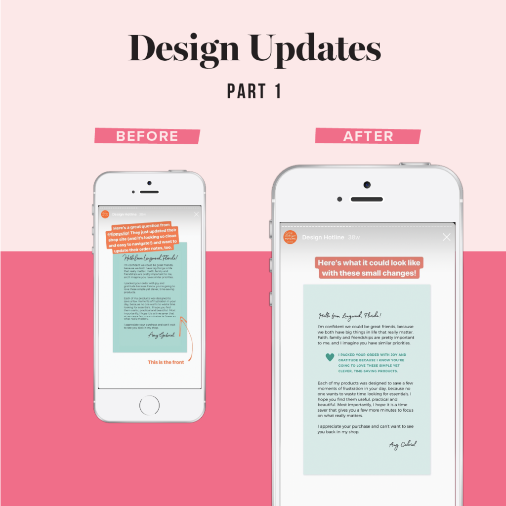
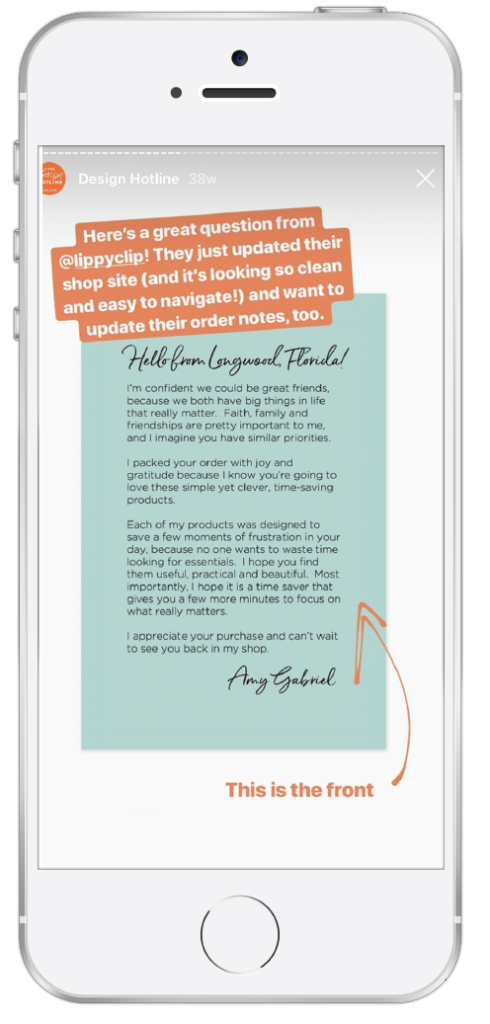
BEFORE
Lippy Clip updates their shop site and wanted to refresh their order notes to match.
When working with bigger blocks of text, I like to see something bolded or pulled out of the copy. Doing this will give customers a visual point to latch on to–a smaller bit of text to read that convinces them to read the whole letter.
We can also scale down the script signature at the top and bottom, so that things look a little more balanced and more visual weight is given to the pulled out quote.
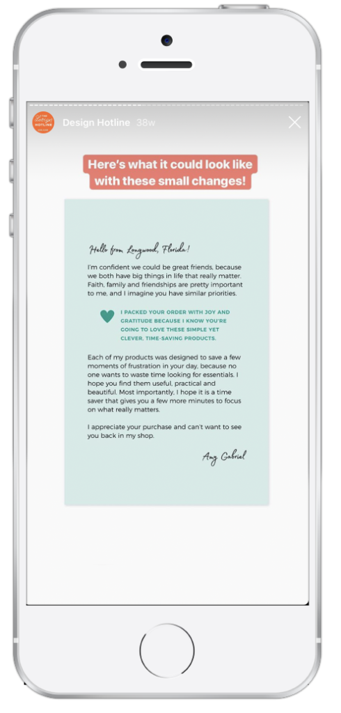
AFTER
With a few small changes we’ve created more visual interest to draw the view in ,and made the order note easier and more pleasant to read!
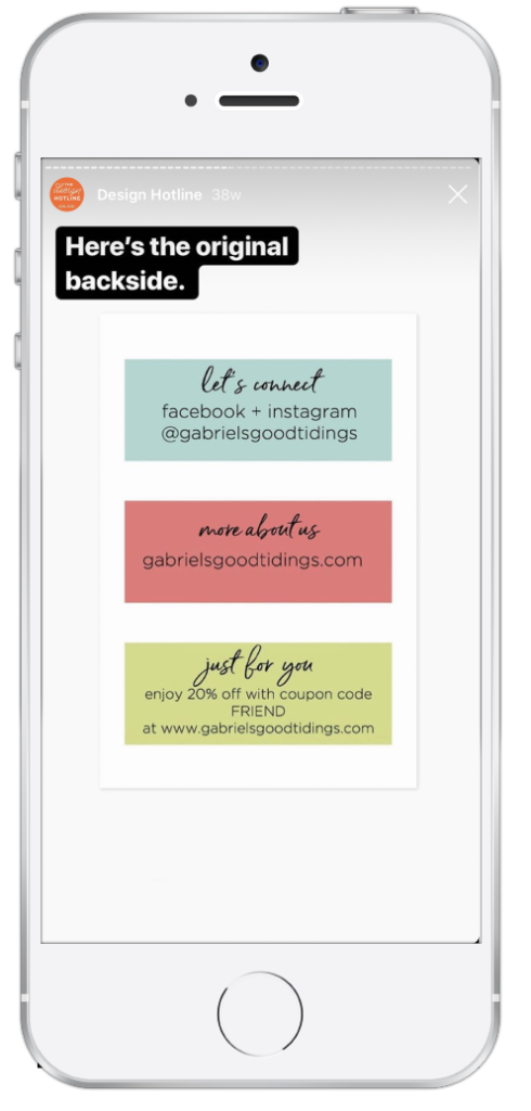
BEFORE
The back side of the order note got a refresh, too!
This is currently designed like a list where everything has equal weight. But, there’s actually a clear hierarchy here:
- They got a discount!
- They can tag you and interact with you,
- They can ready more about you (which almost seems redundant at this point since we already have the letter on the front)
So I think we should reflect that hierarchy through the design and give more emphasis to the most important information.
AFTER
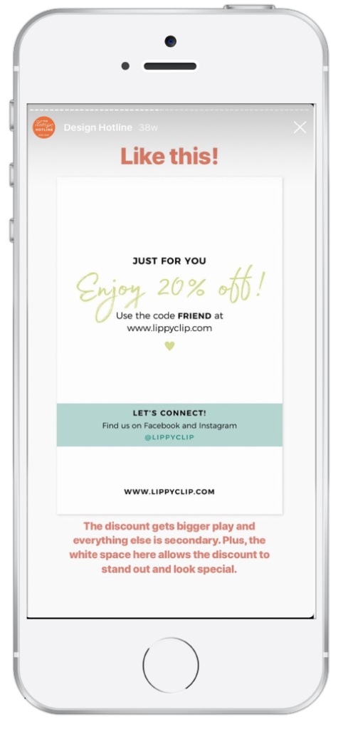
Just like this! The most important part is at a larger scale and has more space to breathe. This helps it to stand out and to make it feel special.
Stuck on a design project and want to submit a question to The Design Hotline? Follow me on Instagram @NicoleAYang and send me a DM with your question. Remember — send me a photo or screenshot of the project you’re working on. Depending on the volume of requests I receive not all submissions will be answered. By submitting, you are giving me permission to repost your question on my Stories.

