How to Work with Text on a Flyer
December 19, 2019

We’re on a mission to make design easier! Every week, we answer a question from our Design Hotline— an Instagram line where we walk you through your biggest design questions! Here’s a submission we recently answered.
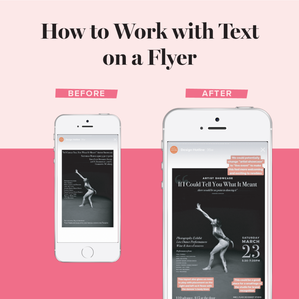
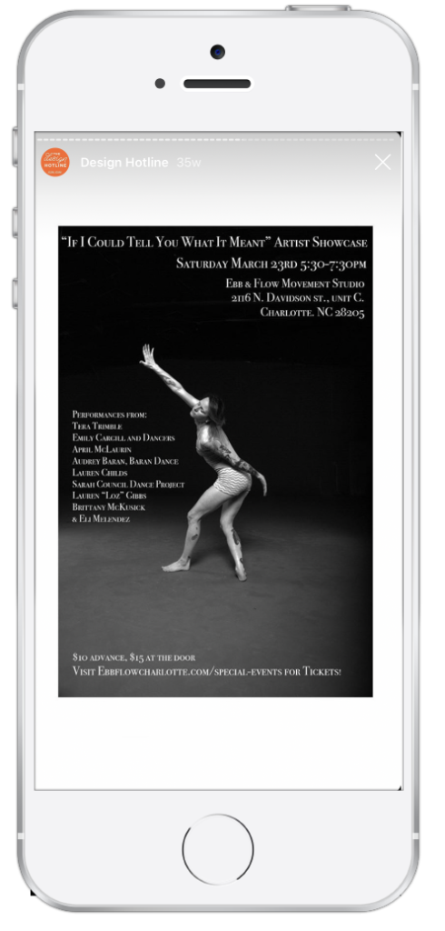
BEFORE
Working with a lot of text can be tricky, but especially when you only have one page to use! Here is an example of how to format your text when creating a flyer.
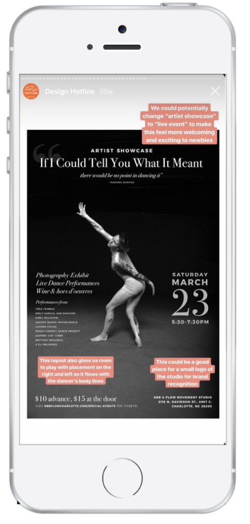
First, let’s work with hierarchy. The biggest thing on the page should be the fact that this is an event/showcase, and what it’s called. We an move location down and make it much smaller. This gives us room to include the full quote that the showcase is named after, too.
It will also help if we add in another, more readable font. This will allow us to decrease the text size for the details that are not a priority (like performer names). This gives us room to add in details that are more relevant to the attendee–types of art, wine, and food.


AFTER
Now we have the room to experiment with the layout/placement without losing the hierarchy of the information!
Stuck on a design project and want to submit a question to The Design Hotline? Follow me on Instagram @NicoleAYang and send me a DM with your question. Remember — send me a photo or screenshot of the project you’re working on. Depending on the volume of requests I receive not all submissions will be answered. By submitting, you are giving me permission to repost your question on my Stories.
Leave a Reply Cancel reply
Copyright 2025 Nicole A. Yang, LLC
Our Grant Program
Where Your Money Goes
YOUTUBE
Privacy Policy
lab@nicoleyangdesign.com
Email us at
Join me on Instagram!
@nicoleayang
Raleigh, NC
Based in