Up Your Infographics Game, Part 2
We’re on a mission to make design easier! Every week, we answer a question from our Design Hotline— an Instagram line where we walk you through your biggest design questions! Here’s a submission we recently answered.
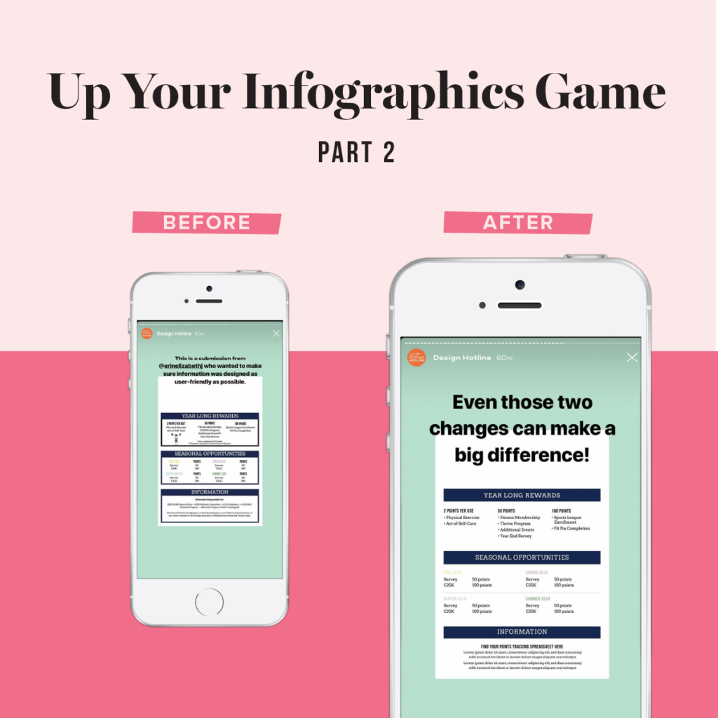
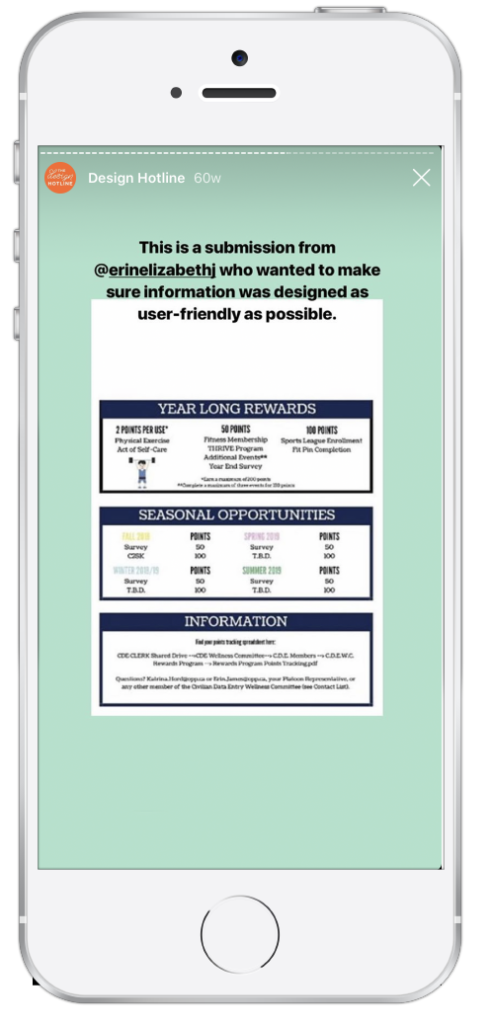
BEFORE
In order to make this example more user-friendly, make sure the columns are the same width so information looks really clean and organized. The spacing between columns in this before example is inconsistent because of this, making it harder to read. I personally always like left-aligned because I think options are more obvious that way.
Next, take a look at the points. They are given just as much priority as the season in the example, so it doesn’t look like the points apply to the task–they look totally separate. Reworking the hierarchy here and giving points less space and prominence will help with understanding.
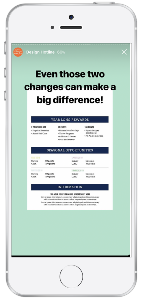
AFTER
See what a difference those two small changes can make?
Stuck on a design project and want to submit a question to The Design Hotline? Follow me on Instagram @NicoleAYang and send me a DM with your question. Remember — send me a photo or screenshot of the project you’re working on. Depending on the volume of requests I receive not all submissions will be answered. By submitting, you are giving me permission to repost your question on my Stories.


